Travel Beyond
A landing page for a company selling trips to space — my first UX/UI project, redesigned two years later to see how far I’ve come.
- UX/UI designer
- Dec 2023 · Redesign 2026
- Master in Digital Experience Design, BAU
- Academic · Landing page
- Figma · Photoshop · VS Code
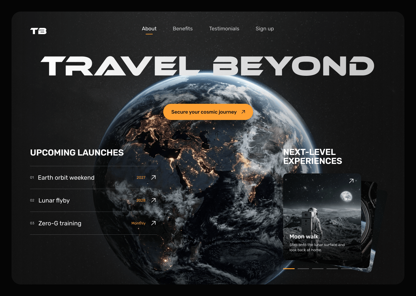
My first UX/UI project.
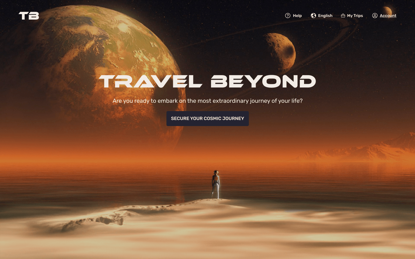
Travel Beyond was the first design project of my Master’s in Digital Experience Design at BAU Barcelona. The brief: a desktop and mobile landing page for a company promising trips to space within three years.
The goal wasn’t only to inform — it was to make people feel the pull of outer space, and leave their details to be part of it.
From a priority guide to code.
I ranked what the page had to say — value proposition, benefits, testimonials, sign-up, footer — sketched it on paper, refined it in mid-fidelity wireframes in Figma, built a small design system and a clickable prototype, and finally coded it in HTML, CSS and JavaScript.
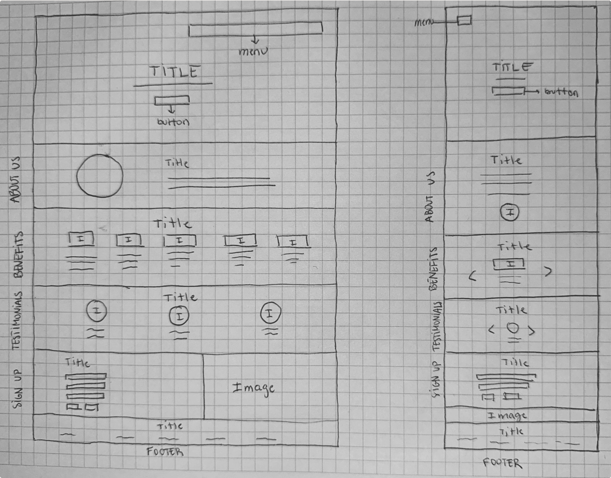
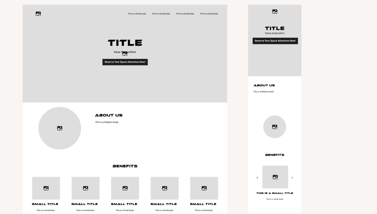
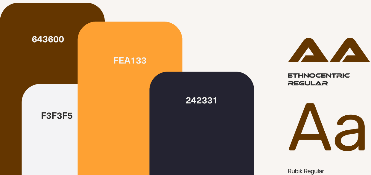
Redesigned to see how far I’ve come.
In 2026 I went back to it with everything I’ve learned since — research, design systems and building real products. Same brief, same fonts — Ethnocentric and Rubik — and the same copy and photos as a starting point.
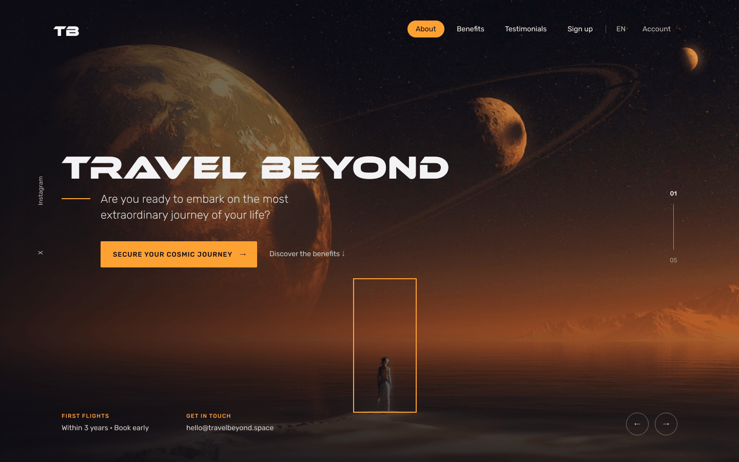
What changed is how the page makes decisions — and the mood: from a sepia poster to a dark, quiet stage where the planet and the one call to action do the talking.
Fewer things, said louder.
- A hero that sells the tripThe planet sits at the centre with one orange button, upcoming launches on one side and experiences on the other — the page answers “where can I go, and when?” before you scroll.
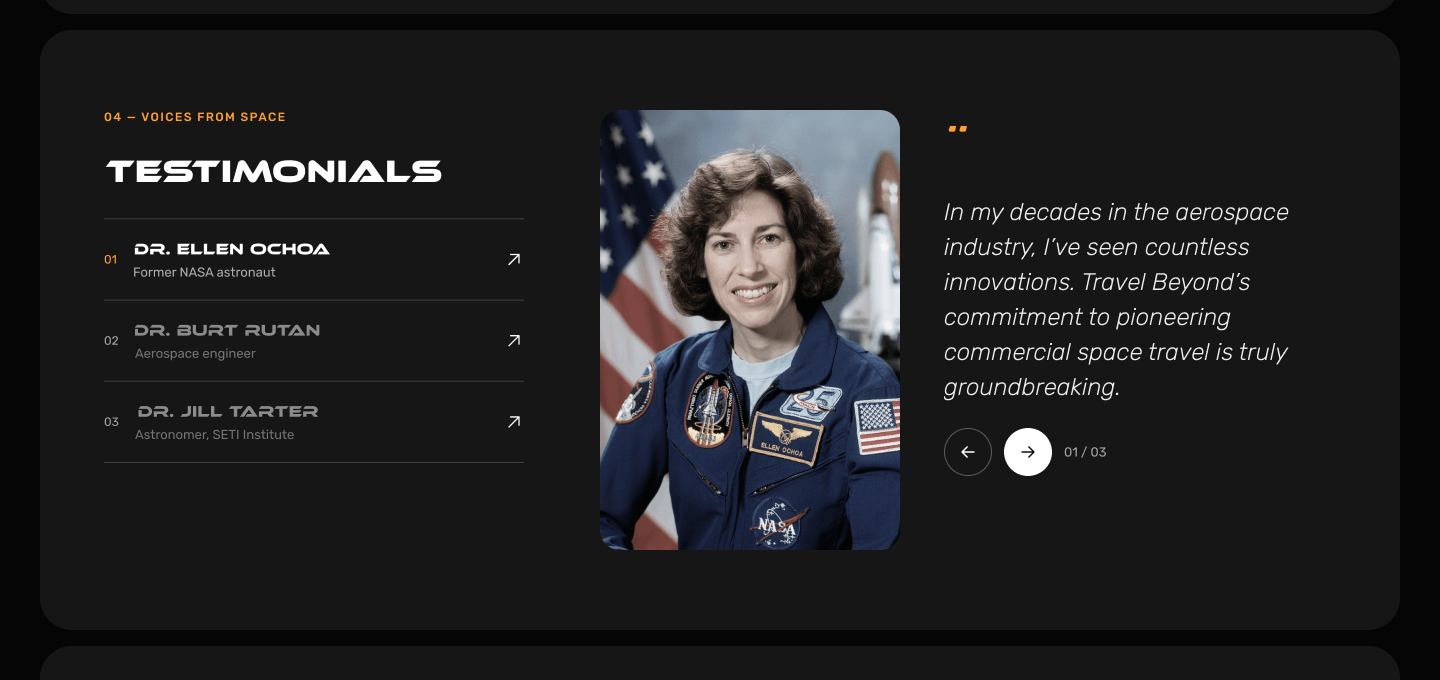
- Black, with orange that means somethingBrown and night blue gave way to near-black panels. Orange is kept for what you can act on: the button, the active state, dates and numbers.
- Numbered sectionsEach section is its own rounded panel with one job and a number, so the page reads as a journey from 01 to 05.
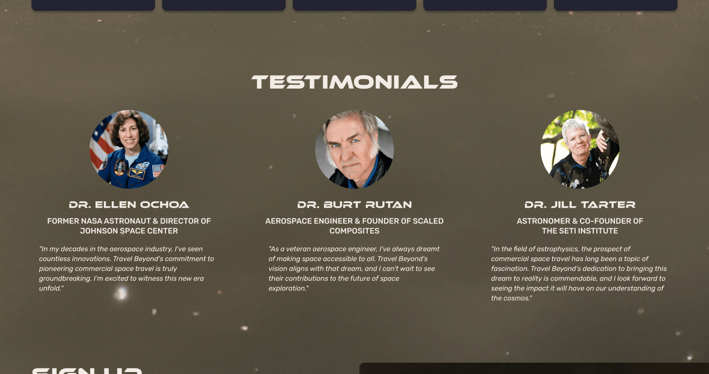
- One voice at a timeTestimonials became a list of names next to one large quote and portrait, instead of three small columns competing for attention.
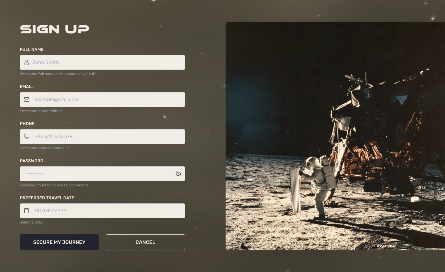
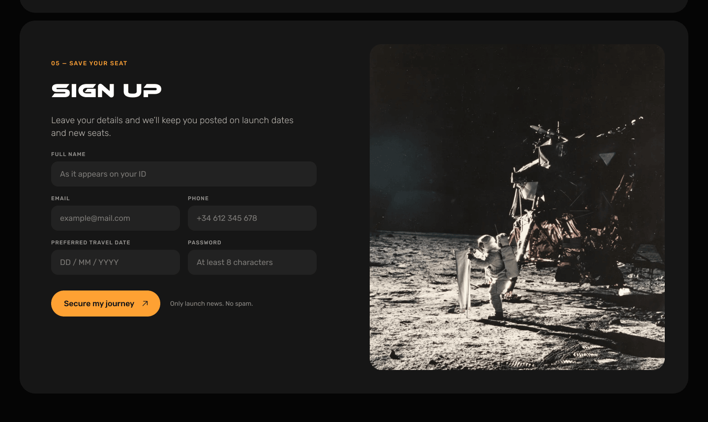
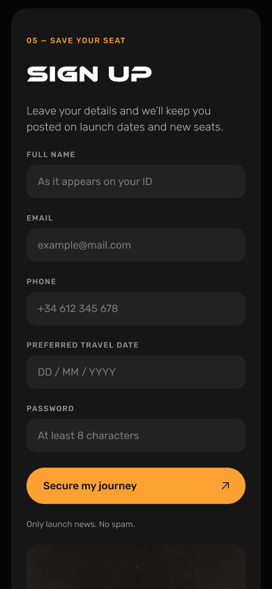
- A form that asks lessTwo columns of soft fields, one clear button — and no “Cancel” on a landing page.
Built for the thumb, too.
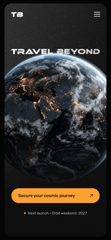
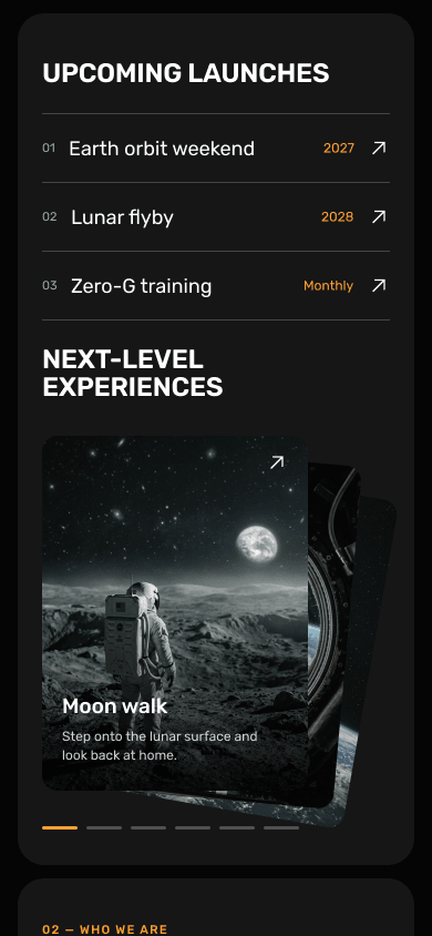
On mobile the hero keeps just the planet, the title and the button; launches and experiences move to their own panel, benefits become a row you swipe, and the form a single column.
The first redesign stayed closer to home.
My first pass kept the brown, orange and night blue and the original planet scene, and fixed the structure. It worked — but it still looked like 2023. Pushing it to a black, quieter stage is what made the redesign feel new.
What the redesign taught me.
The 2023 page followed the process step by step. The 2026 one makes choices: what to show first, what to cut, and the one thing to ask for.
Putting both side by side is the clearest measure I have of how my eye — and my judgement — have changed since my first project.
- 2
- 2
- 1