Giave
Making a complex machinery-management system clear enough to act on — for the people who run it every day.
- UX/UI designer
- 2025
- Client project · 100x100net
- Internal admin + client portal
- Research · IA · UI · Dev handoff · QA
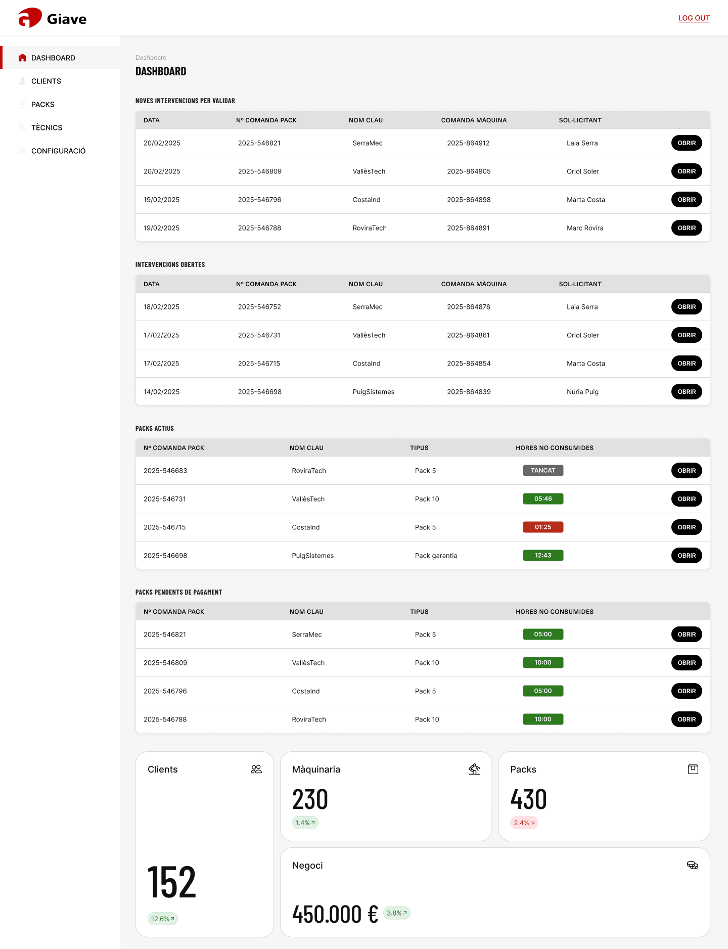
An operational tool, not a website.
Giave sells and services industrial machinery. Its team needed one place to see every customer, every machine, the service packs they’ve bought and the hours left on them — and customers needed their own window into the same data. I worked on both: the internal admin and the client area, from research and benchmarking to the interface, handoff to front- and back-end, and QA of the build.
Seven connected things, one decision.
Every question an employee asks crosses several entities at once. The real design problem wasn’t making screens look better — it was making these relationships readable fast enough to act on.
- ?Which machines does this customer have?
- ?What type of machine is it?
- ?Is it in service right now?
- ?Who is the technician?
- ?What pack has the customer bought?
- ?How many contracted hours are left?
- ?Does anything need attention?
- ?What’s urgent — or coming up?
Two doors into the same data.
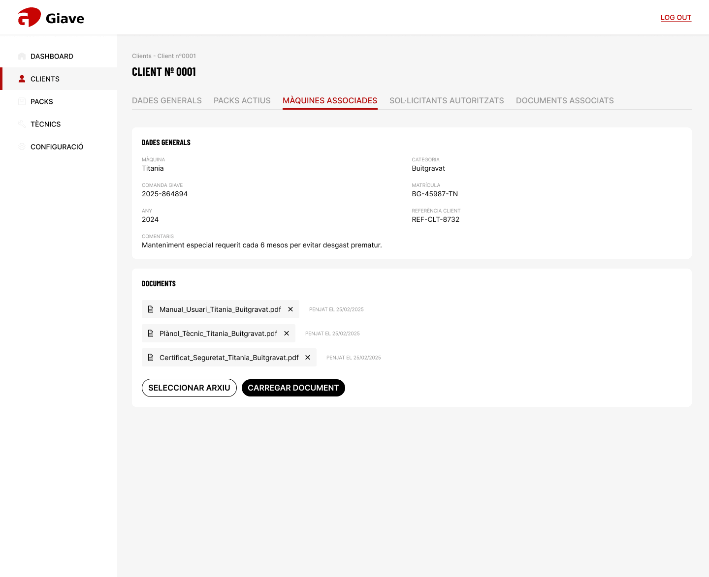
Staff and customers look at the same machines, packs and interventions — but need different things from them. The admin is organised around managing many customers; the client area around one customer’s own fleet. Inside each customer record, tabs keep related information one click away instead of scattered across screens.
- Dashboard
- Clients → General · Packs · Machines · Requesters · Documents
- Packs → Pack sheet · Tasks
- Technicians
- Settings
- Dashboard
- My details
- Requesters
- Machines
- Packs → Pack sheet
- Documents
- Interventions
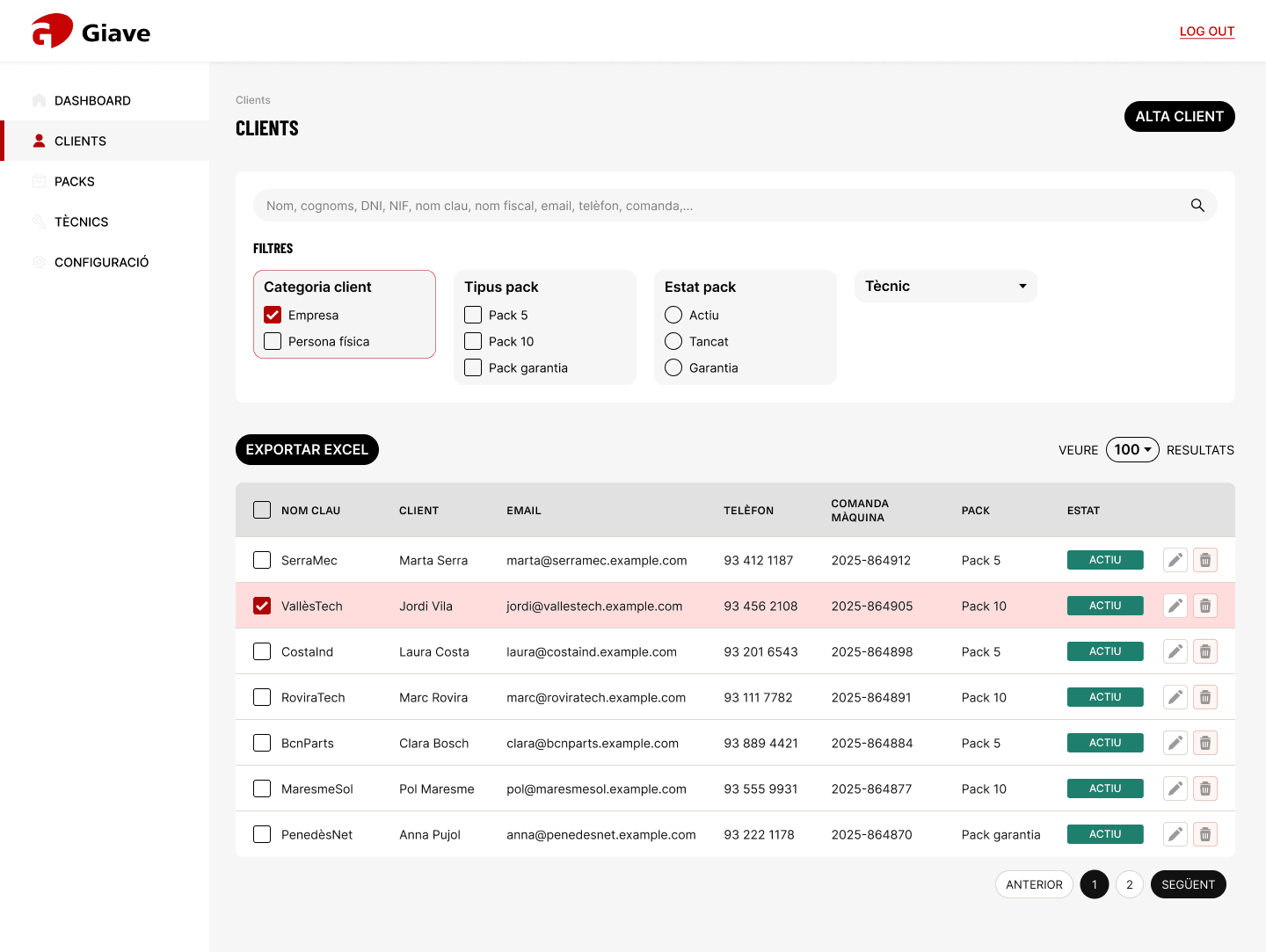
Narrow down, don’t scroll.
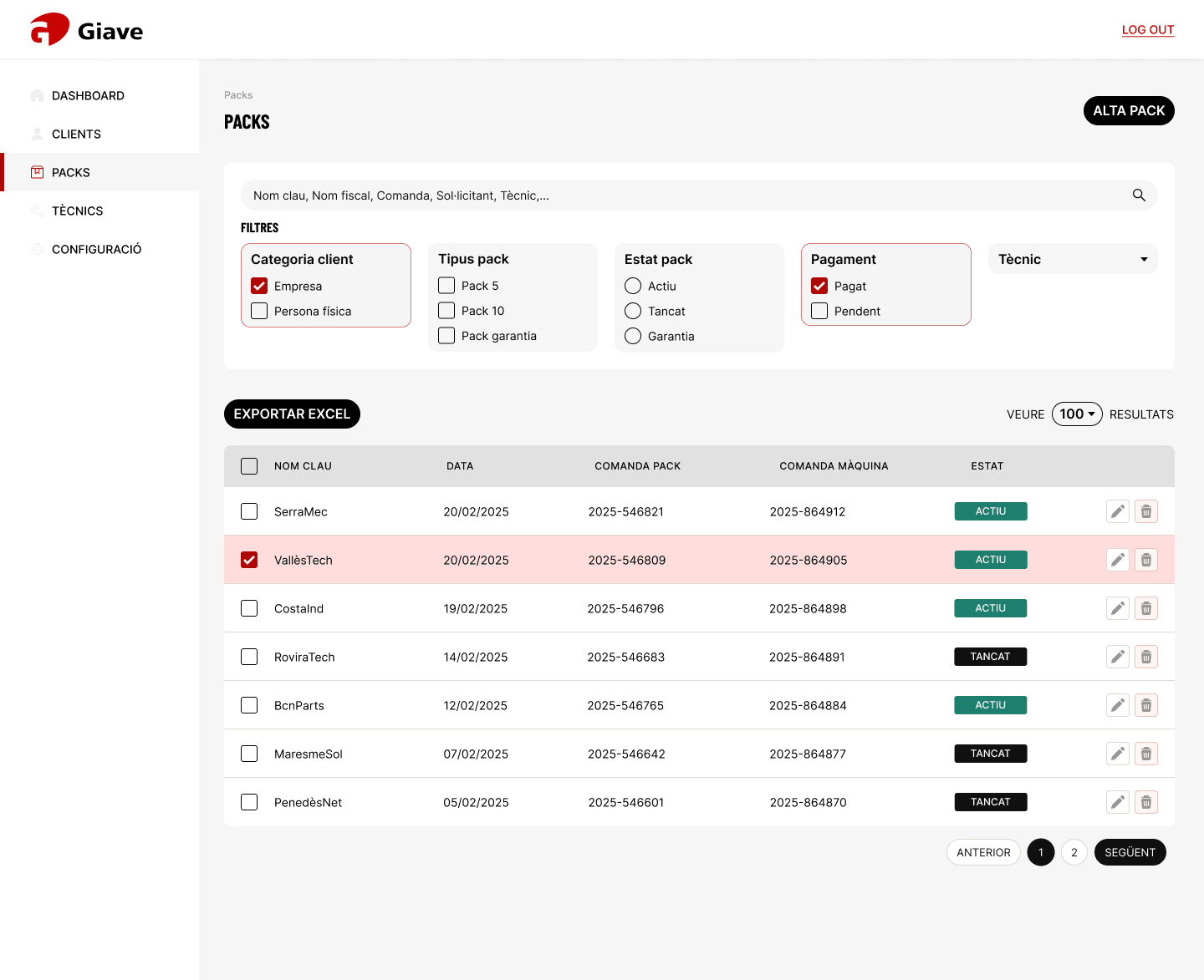
Instead of showing everything at once, the lists use progressive filtering: customer type (company or individual), pack type (5h, 10h, guarantee), pack status, payment and technician — plus a single search that understands names, tax IDs, order numbers and machines. Selected filters are outlined, so you always know what you’re looking at.
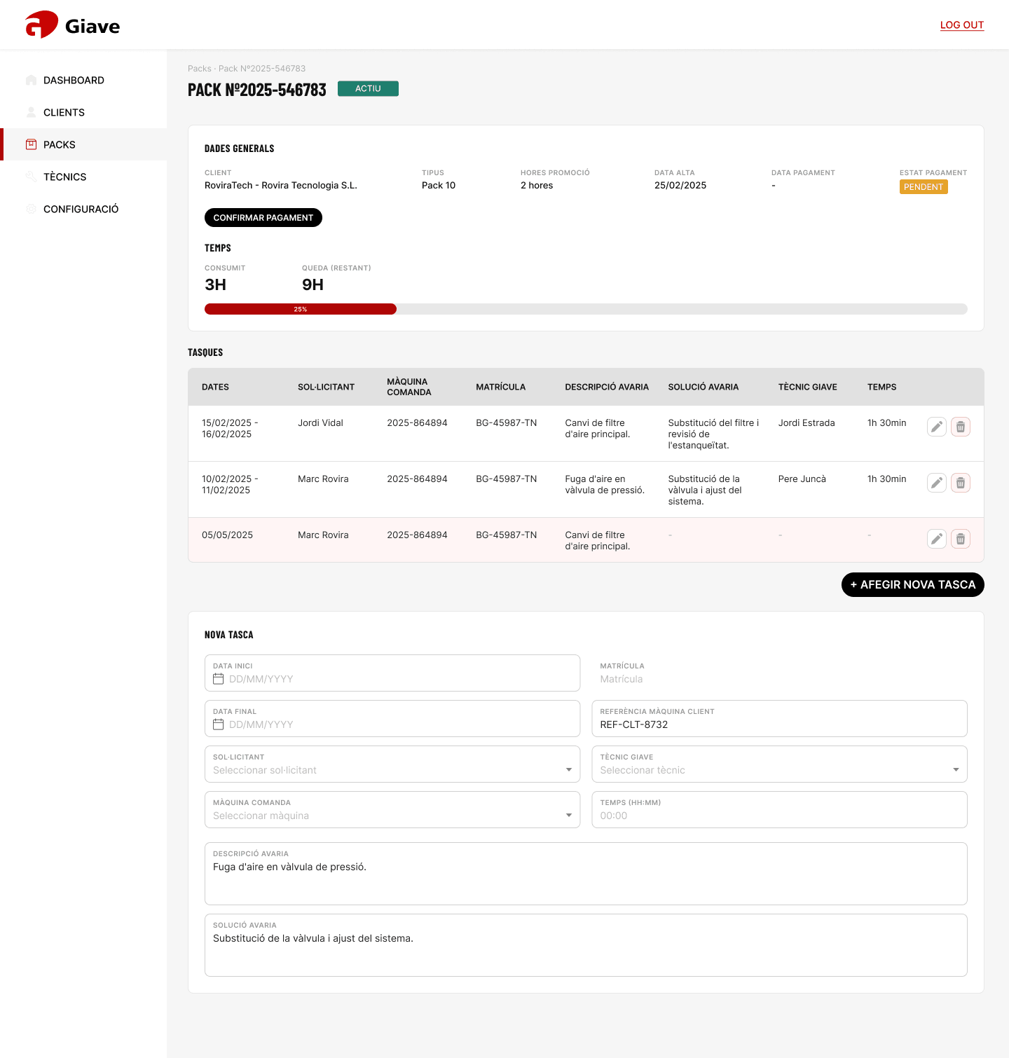
Hours you can read at a glance.
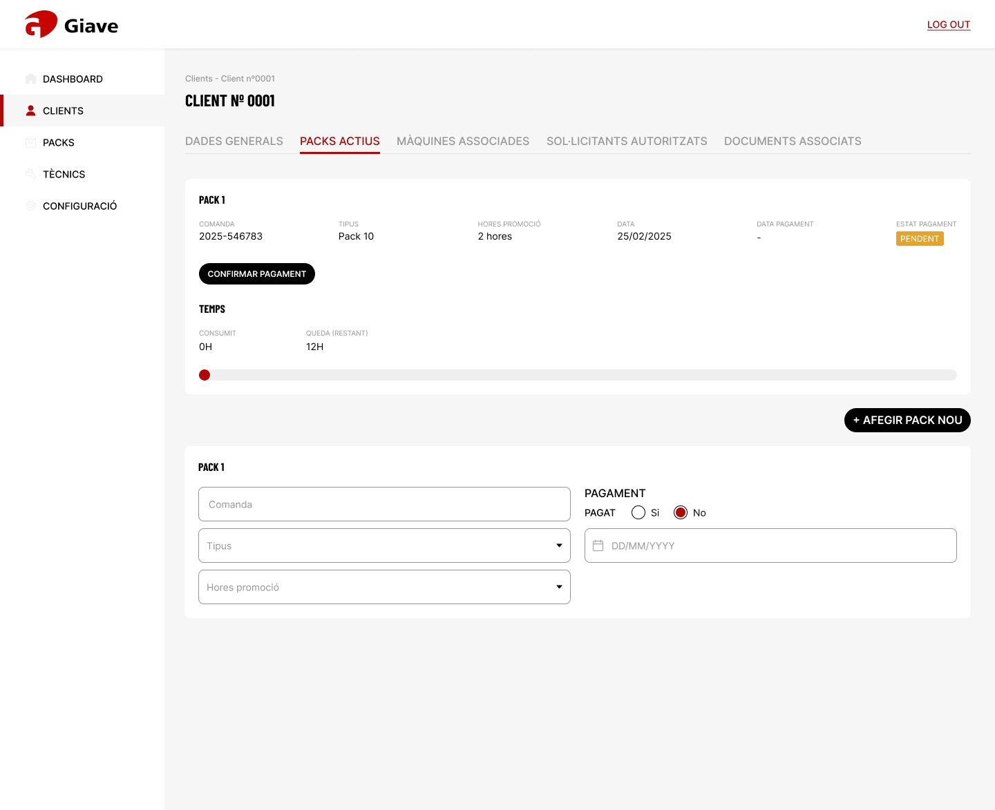
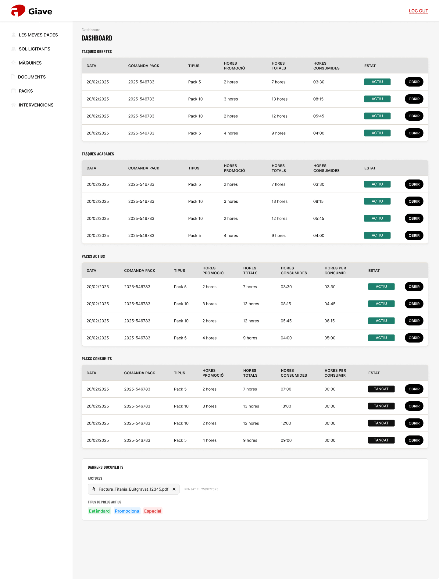
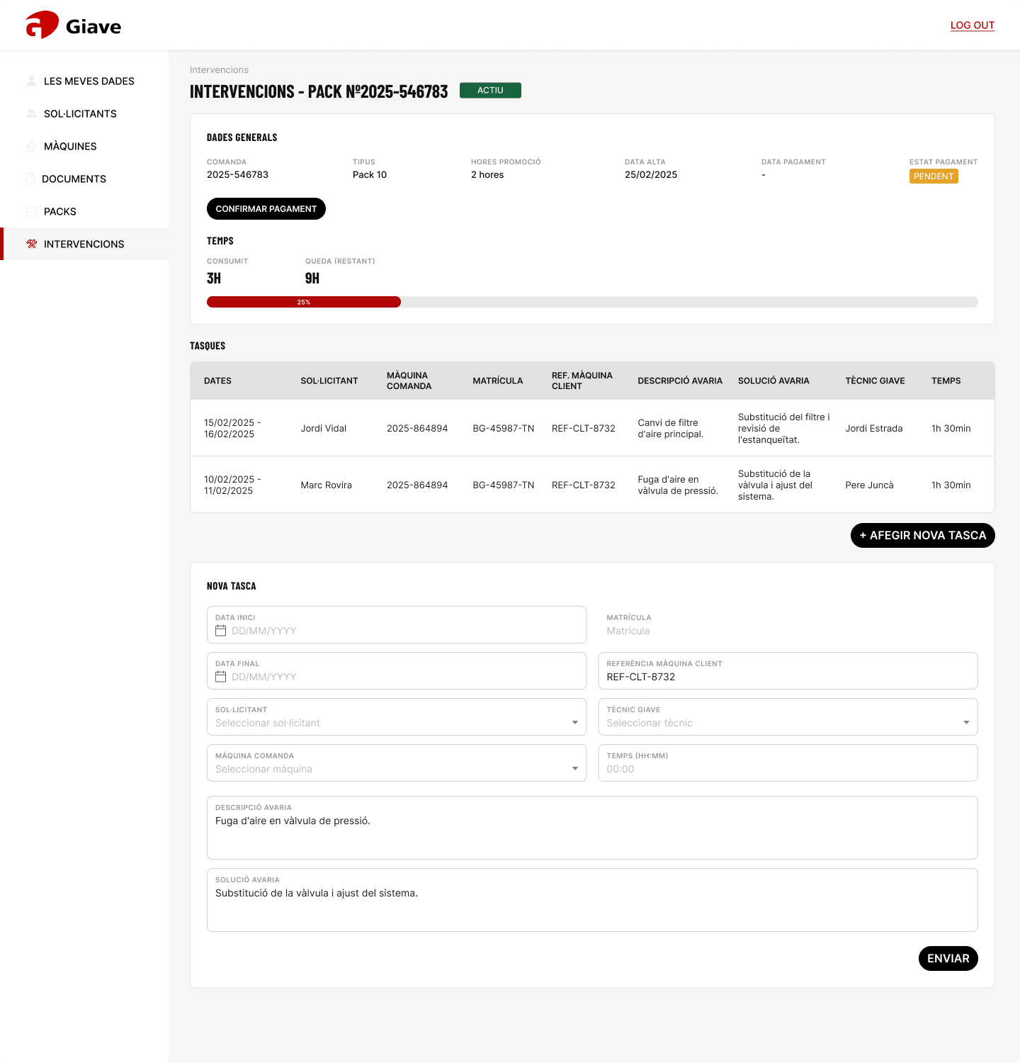
Customers buy service packs — 5 hours, 10 hours or a guarantee — and every intervention consumes time. The interface turns that into a simple progress bar and a status tag. The key state is “<2h”: when a pack is about to run out it has to be noticed, because someone needs to act. So red is reserved for that — not spread across every label.
Compact, calm, and honest about urgency.
Barlow Condensed gives headings character and saves space in a data-heavy layout; Raleway keeps body text readable. Tables, cards and filters share one spacing system and a small set of reusable components. Colour carries meaning only: green for active, grey for closed, amber for pending payment, red for genuine urgency.
The admin and the client area, side by side.
26 screens across both portals, built from the same components — so the team and their customers read the same data the same way.
Complexity → structure → clarity.
Designing for a data-heavy B2B product taught me to start from the decisions people make, not the data they have. Working inside a real business and technical ecosystem — with stakeholders, developers and QA — meant balancing what the business needed with what employees could take in at a glance.
- 2
- 26
- 7
- <2h